Anushka Mathur
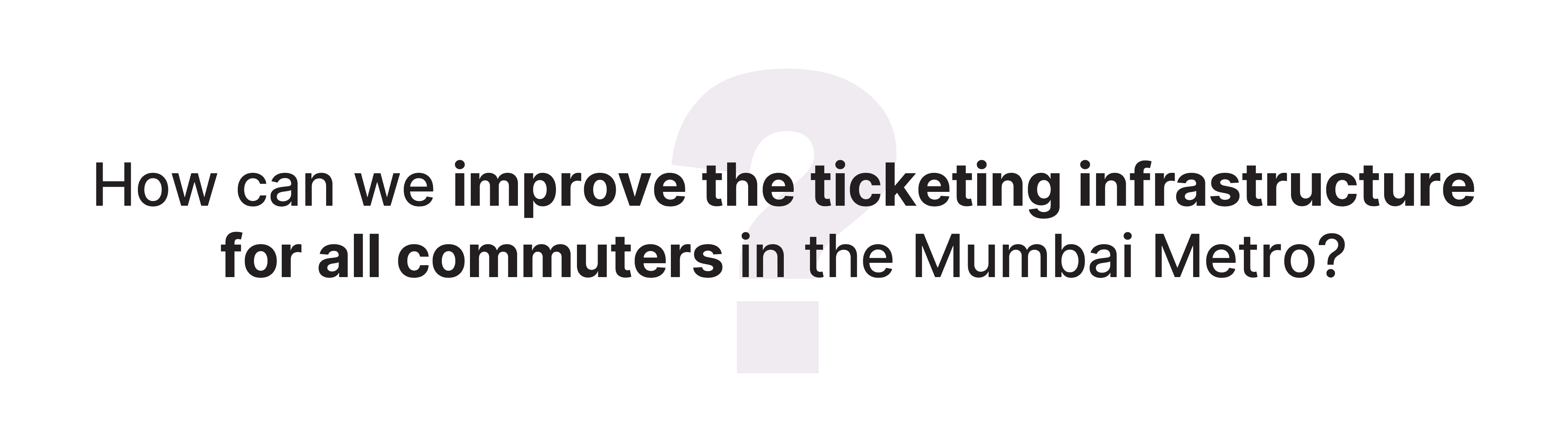
Designing a ticket kiosk with a working User Interface
(UI) for the Mumbai Metro.
Feb 2022 - March 2022
Group Project
Background
The newly opened Mumbai Metro is a rapid transit (MRT) system serving the city of Mumbai and the wider Mumbai Metropolitan Region in Maharashtra, India. It is designed to reduce traffic congestion in the city and supplement the overcrowded Mumbai Suburban Railway network. The network is made up of 10 colour coded lines that server 100+ stations. Since the transit network is still being developed, people often have to spend upwards of 30 minutes waiting in lines. As a result, before the city expands its metro network, it is essential to enhance its ticketing system and overall user experience. We were tasked with designing a SmartCard kiosk/machine that would be installed at all the stations for issuing new cards, recharging cards, and getting single journey tokens.
CityNAV/MMRC
The Situation
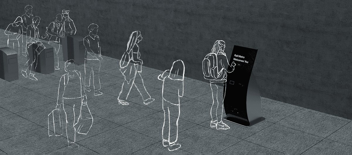
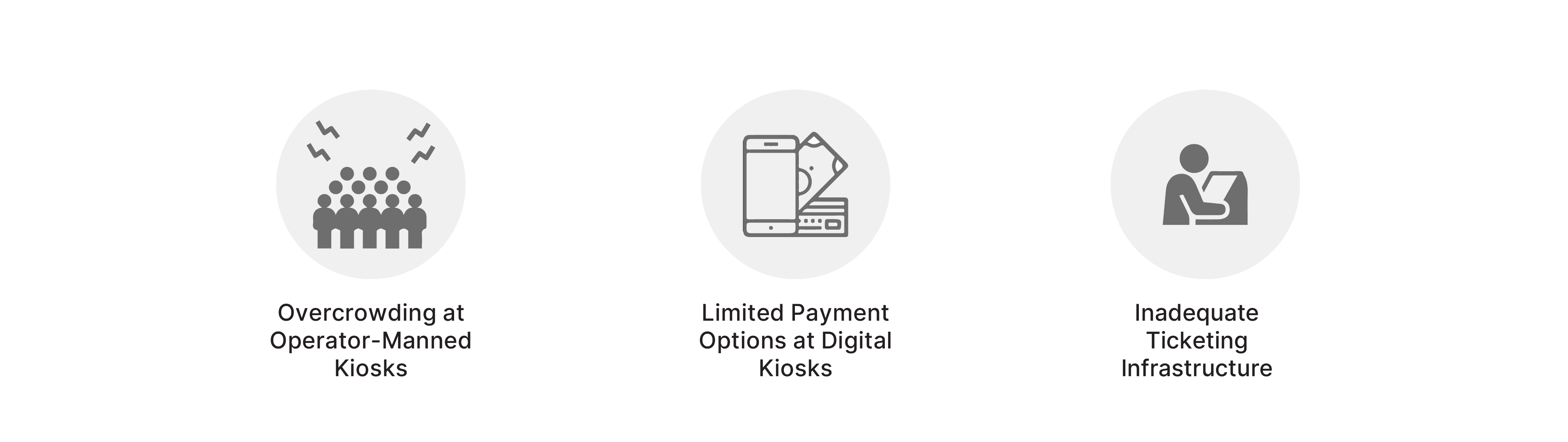
The Mumbai Metro, developed as a solution to ease the strain on the Suburban Railway network, faces critical challenges in its operational phase. At present, only 3 lines are operational serving a total of 43 stations. Overcrowding plagues operator-manned kiosks, creating long queues and delays for commuters due to the limited number of operational lines and stations. Additionally, the existing digital kiosks offer limited payment options - only cash or card, contributing to increased congestion and frustration among users, as it excludes certain payment methods and prolongs transaction times.
The overall ticketing infrastructure struggles to cope with the burgeoning commuter traffic, resulting in bottlenecks and an unsatisfactory user experience for passengers relying on this essential mode of transportation.
Role
Research: Survey, Participant outreach, Semi-structured interviews, user persona, user journey, site analysis, literature review
Design: Wire framing, high-fidelity prototyping, usability testing
Tools
Figma
Google Docs
Miro
Anushka Mathur
CityNAV/MMRC
CityNAV/MMRC
Designing a ticket kiosk with a working User
Interface (UI) for the Mumbai Metro.
Designing a ticket kiosk with a working User
Interface (UI) for the Mumbai Metro.
July 2022 - January 2023
Individual Project
Feb 2022 - March 2022
Group Project
Background
The newly opened Mumbai Metro is a rapid transit (MRT) system serving the city of Mumbai and the wider Mumbai Metropolitan Region in Maharashtra, India. It is designed to reduce traffic congestion in the city and supplement the overcrowded Mumbai Suburban Railway network. The network is made up of 10 colour coded lines that server 100+ stations. Since the transit network is still being developed, people often have to spend upwards of 30 minutes waiting in lines. As a result, before the city expands its metro network, it is essential to enhance its ticketing system and overall user experience. We were tasked with designing a SmartCard kiosk/machine that would be installed at all the stations for issuing new cards, recharging cards, and getting single journey tokens.
Anushka Mathur
TerraByte
CityNAV/
MMRC
An immersive museum experience taking
the user into a journey through climate past, present, and future
Designing a ticket kiosk with a working User Interface (UI) for the Mumbai Metro.
July 2022 - January 2023
Individual Project
Feb 2022 - March 2022
Group Project
Background
The newly opened Mumbai Metro is a rapid transit (MRT) system serving the city of Mumbai and the wider Mumbai Metropolitan Region in Maharashtra, India. It is designed to reduce traffic congestion in the city and supplement the overcrowded Mumbai Suburban Railway network. The network is made up of 10 colour coded lines that server 100+ stations. Since the transit network is still being developed, people often have to spend upwards of 30 minutes waiting in lines. As a result, before the city expands its metro network, it is essential to enhance its ticketing system and overall user experience. We were tasked with designing a SmartCard kiosk/machine that would be installed at all the stations for issuing new cards, recharging cards, and getting single journey tokens.
Role
Research: Survey, Participant outreach, Semi-structured interviews, user persona, user journey, site analysis, literature review
Design: Wire framing, high-fidelity prototyping, usability testing
Tools
Figma
Google Docs
Miro
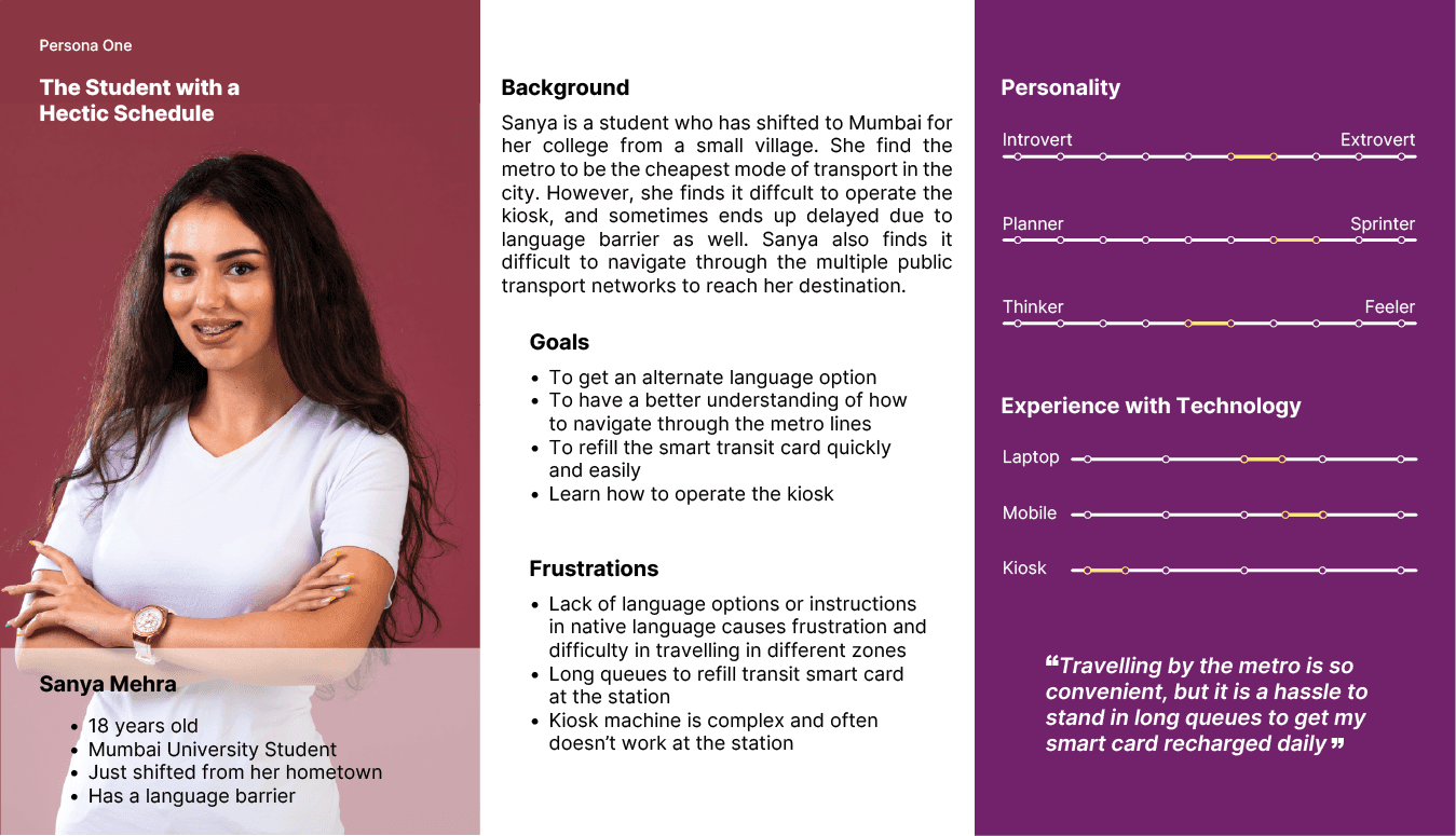
User Personas
The Situation
The Mumbai Metro, developed as a solution to ease the strain on the Suburban Railway network, faces critical challenges in its operational phase. At present, only 3 lines are operational serving a total of 43 stations. Overcrowding plagues operator-manned kiosks, creating long queues and delays for commuters due to the limited number of operational lines and stations. Additionally, the existing digital kiosks offer limited payment options - only cash or card, contributing to increased congestion and frustration among users, as it excludes certain payment methods and prolongs transaction times.
The overall ticketing infrastructure struggles to cope with the burgeoning commuter traffic, resulting in bottlenecks and an unsatisfactory user experience for passengers relying on this essential mode of transportation.
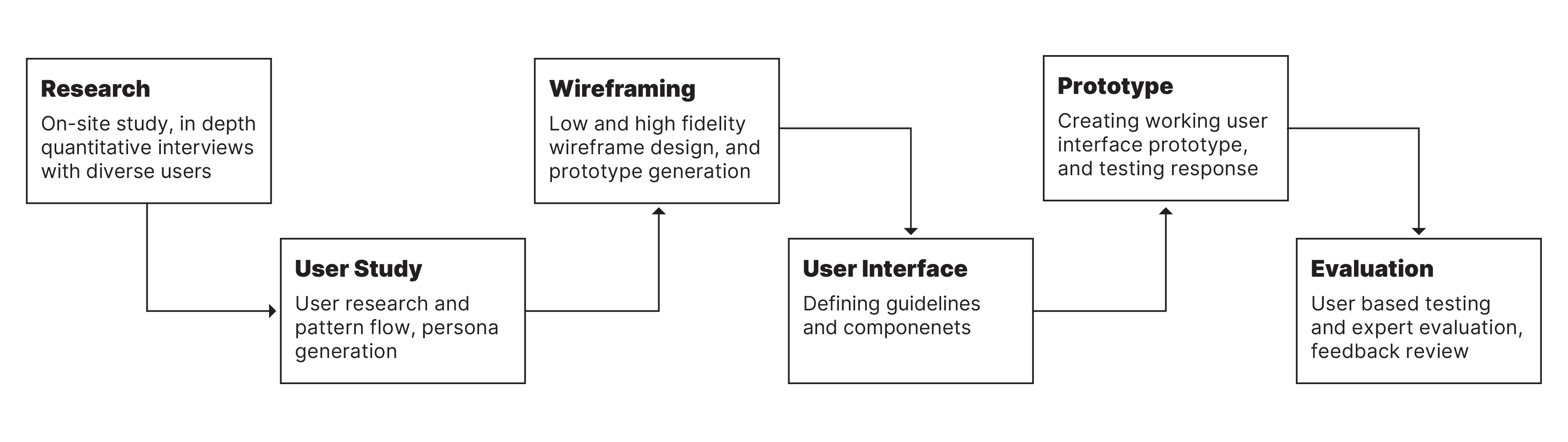
The Process
Research Plan
Stakeholder Mapping
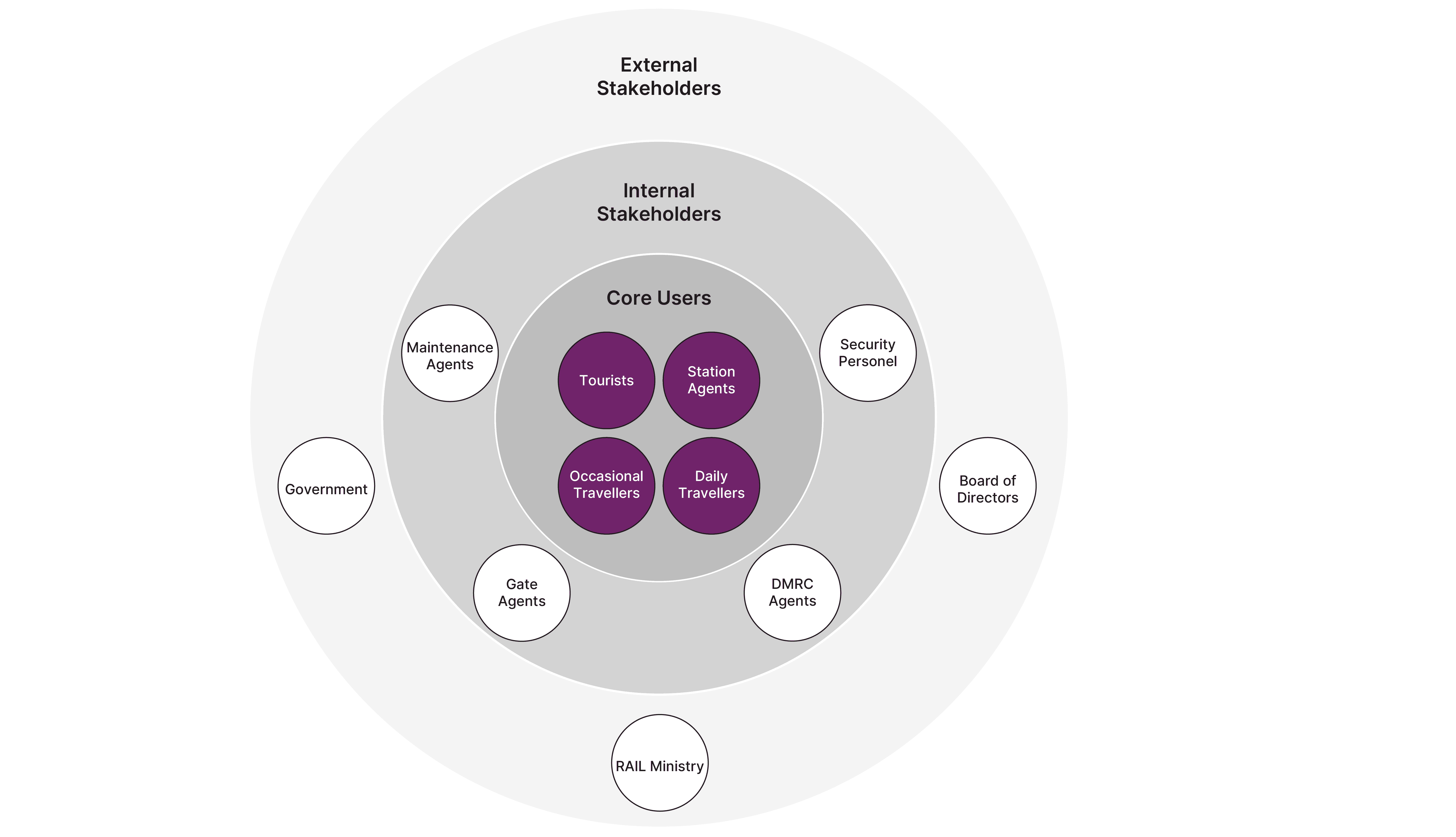
After inverviewing the users, we then created a stakeholder map of all the different users for the metro kiosks
Stakeholder Insights
Daily Travellers
Daily travellers face an issue with quick transactions to recharge their smart cards.
Occasional Travellers
Some users tend to not have exact change or cards to make payments and thus take other transports.
Help Facility
Users often encounter a significant inconvenience when seeking assistance from station agents.
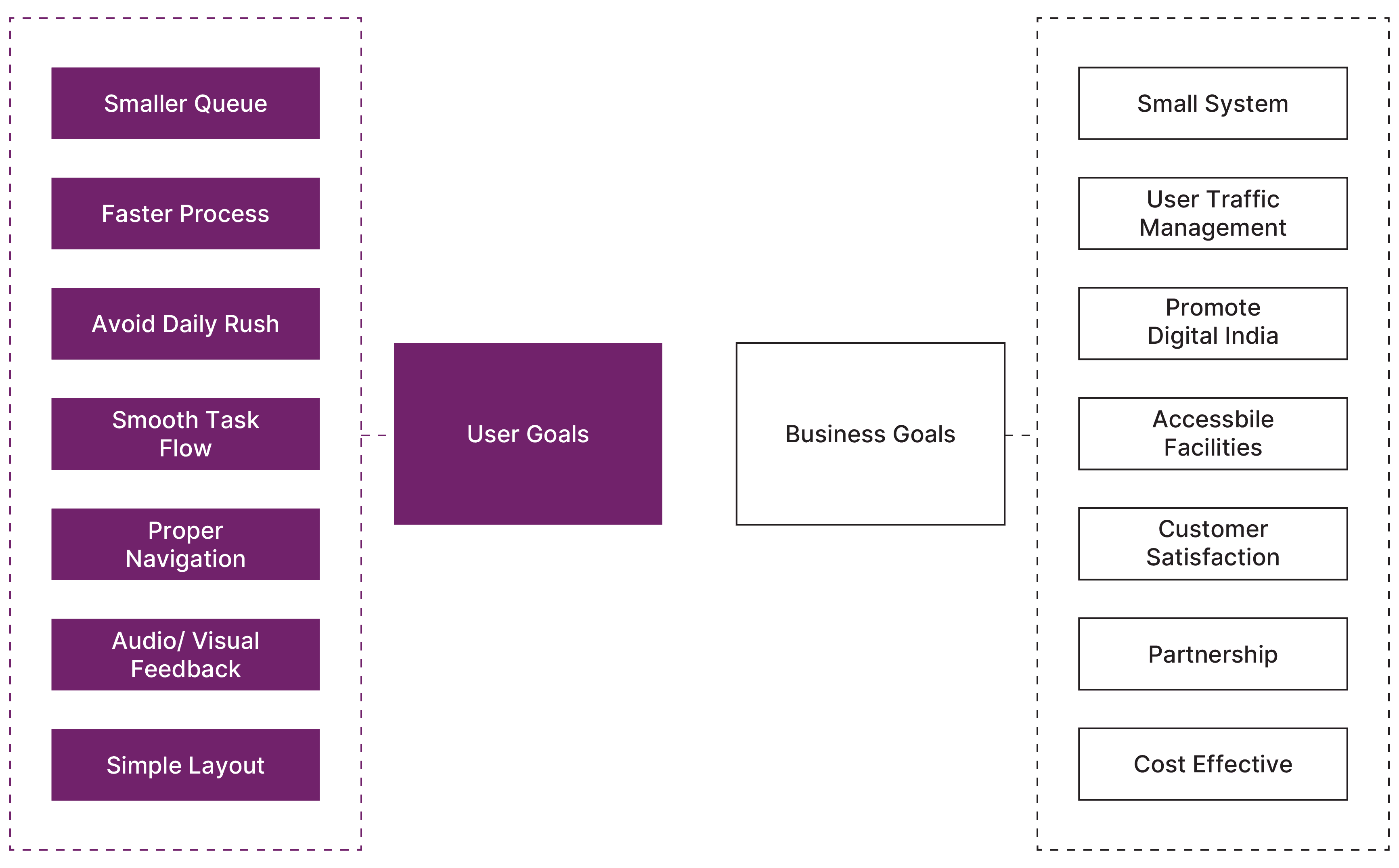
Turning Stakeholder Insights into Design Goals
Payment Options
Digital kiosks need to offer multiple payment options as per user needs including wallet and UPI payments.
Help Facility
Providing an on-screen help facility, which informs the station agents for assistance.
Ticket Options
The kiosks should offer single journey tokens as well for not so frequent users.
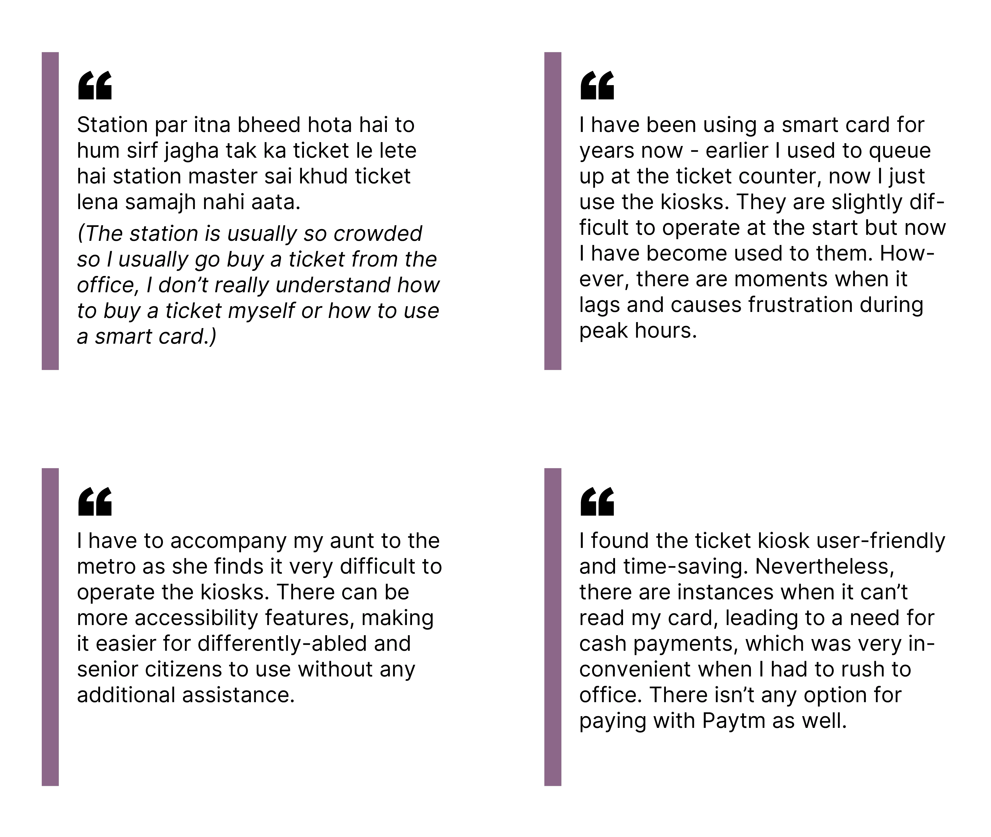
User Interviews
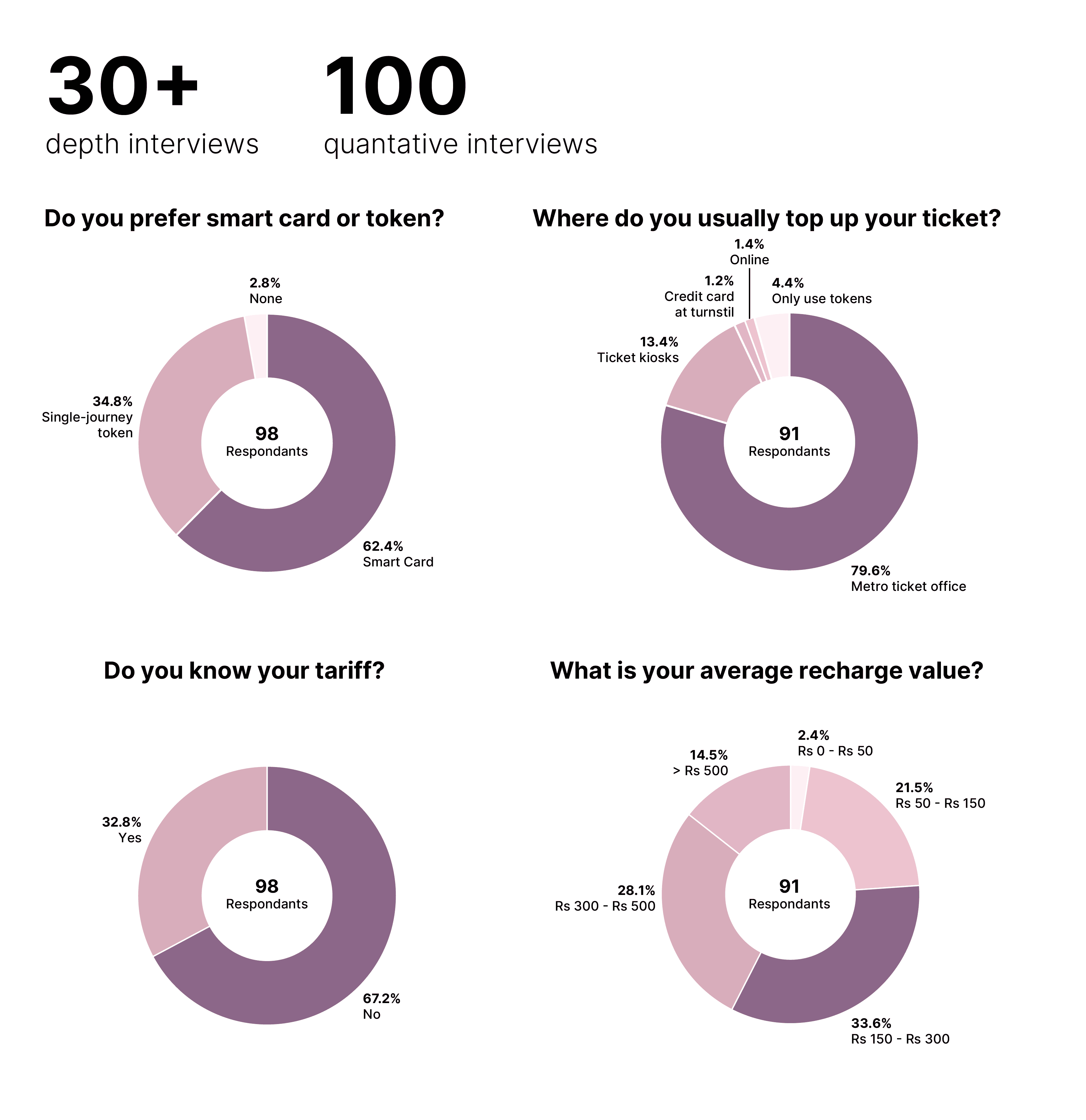
At the start of the project, we carried 100 quantitative interviews and 30 in-depth interviews with daily users to find the key problems associated with the Mumbai Metro ticketing system.
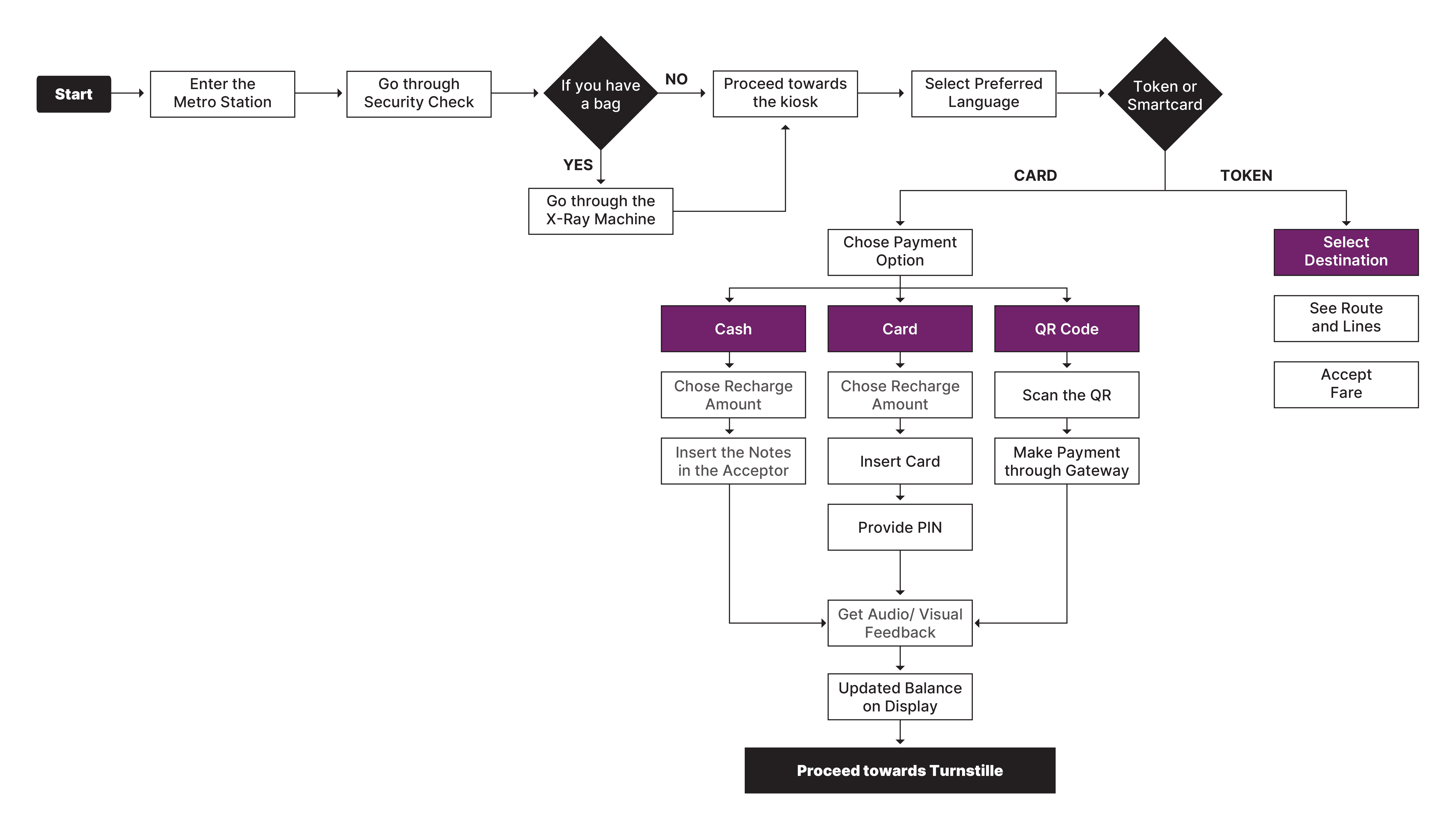
User Journey and Flow
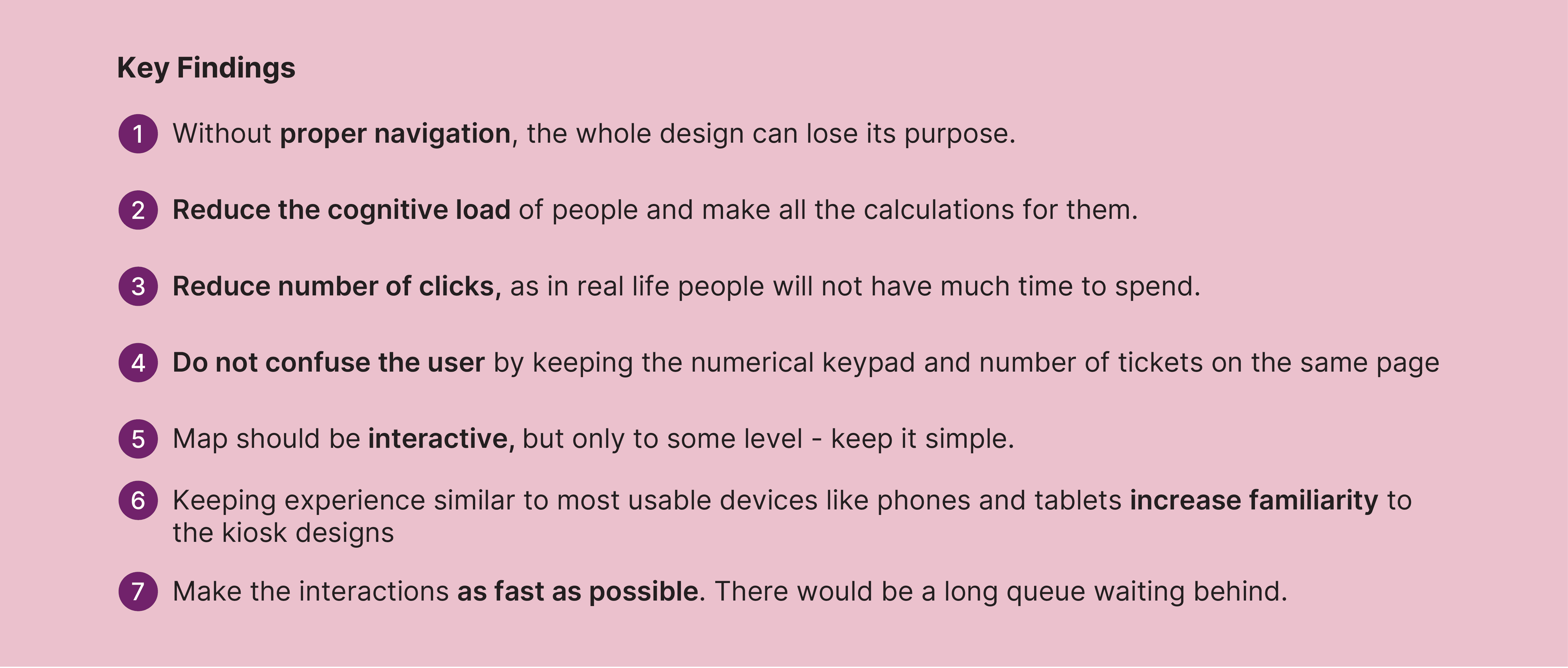
Study unveiled how people preferred a straight-forward method in quick tasks and do not entertain distractions. Therefore, we suggested simpler looking interface and lesser screens. We also compared the interface of servial terminals and considered the logic of our displays when considering the journey map.
Wireframing
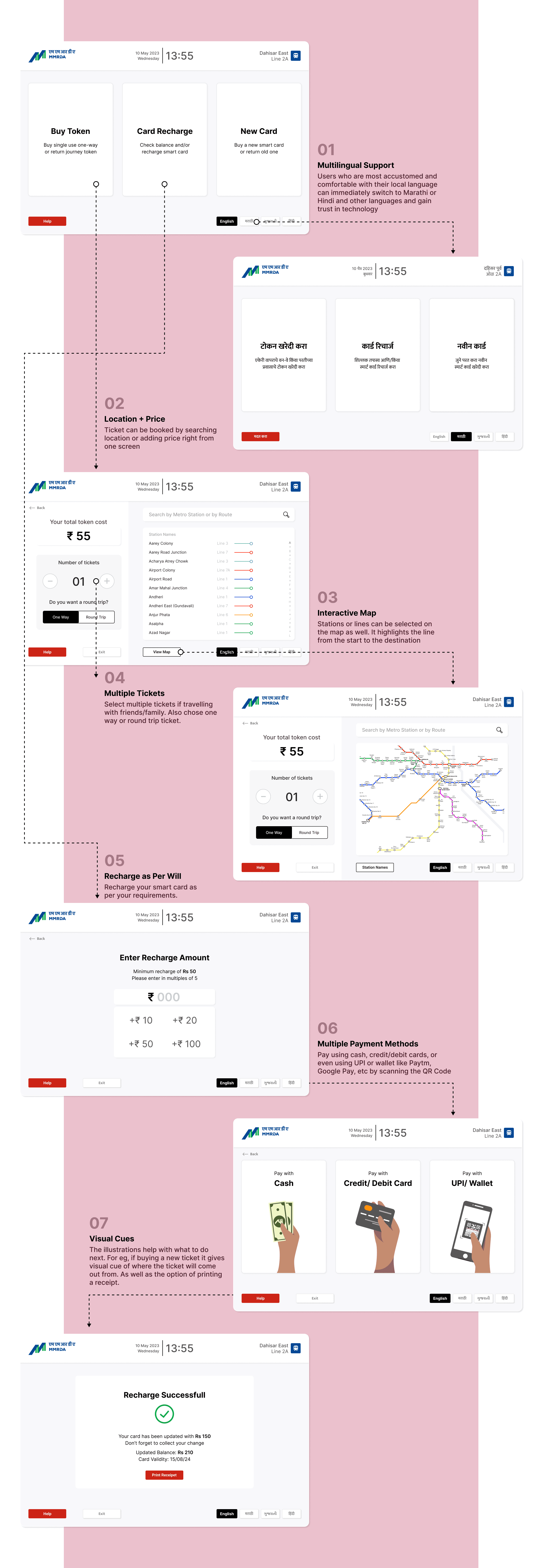
Using the insights from the affinity map, we moved on to create sketch wireframes. We provided multiple language support to address the multilingual population of Mumbai, and recommended a simple UI. We added numerical input on screen as well as provided for physical buttons on the machine. Next, we moved on to refining the sketches in Figma, and deciding on a system and its subsequent patterns.
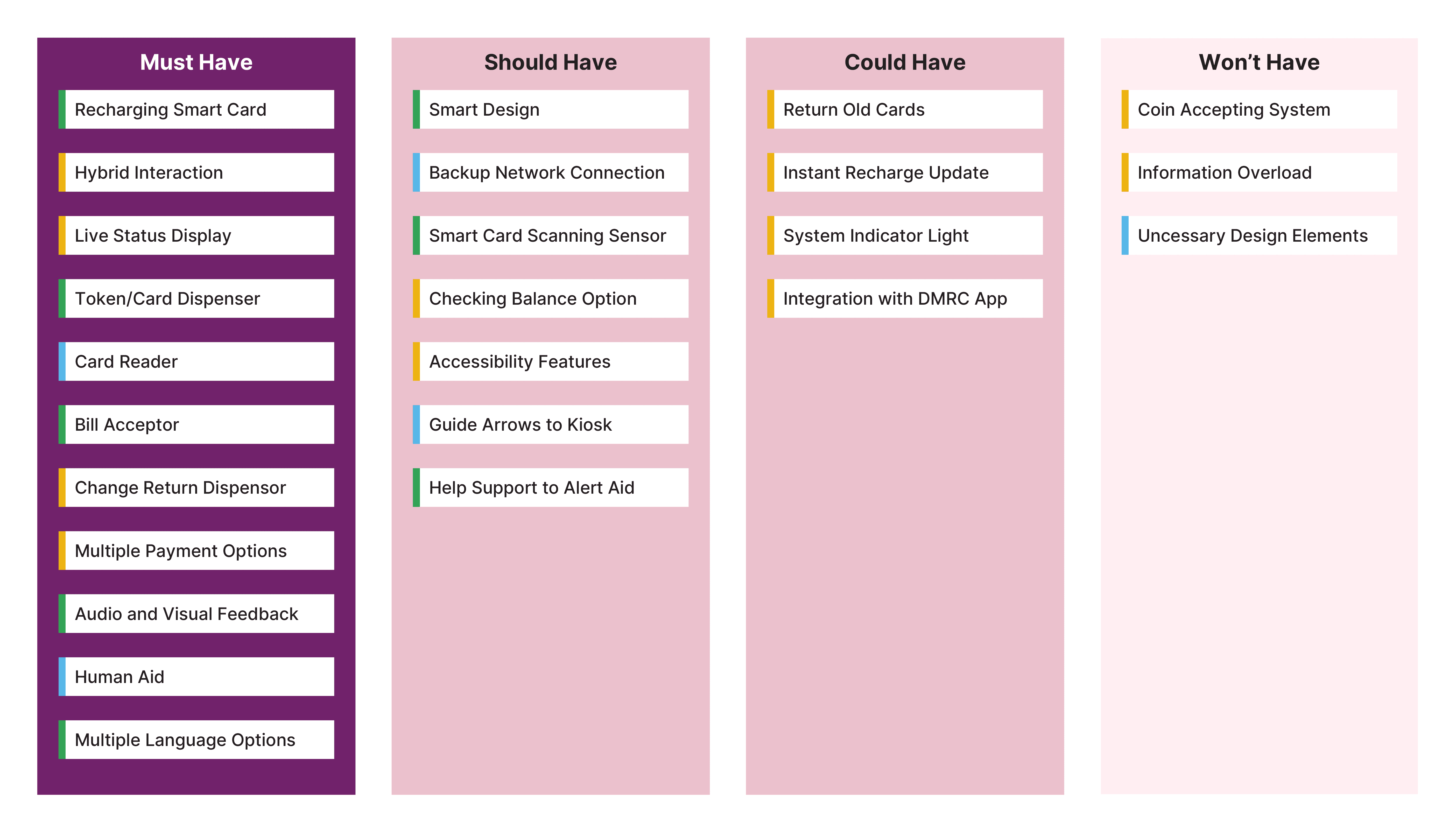
Choosing Features
The area of context as well as the activities involved were analysed in order to build a user-centric interface. These types of tasks were divided into categories based on patterns and behaviours. We divided them into three key categories - Product, Interface, and Space Design. These categories were then further divided using the MoSCoW Method, which led to the finalisation of the key design solutions which could be integrated into the kiosk designs. These design solutions were selected according to their adaptability into accessible navigation systems and information architecture while staying within the technological restrictions.
User Testing
We tested our prototype with 8 user remotely (via usertesting.com) and 5 in-person and later incorporated the insights we had gathered to resign the kiosk screens.
In addition to other questions, two major tasks for usertesting included:
Task 1: Buy a single-journey token
Task 2: Refill smartcard
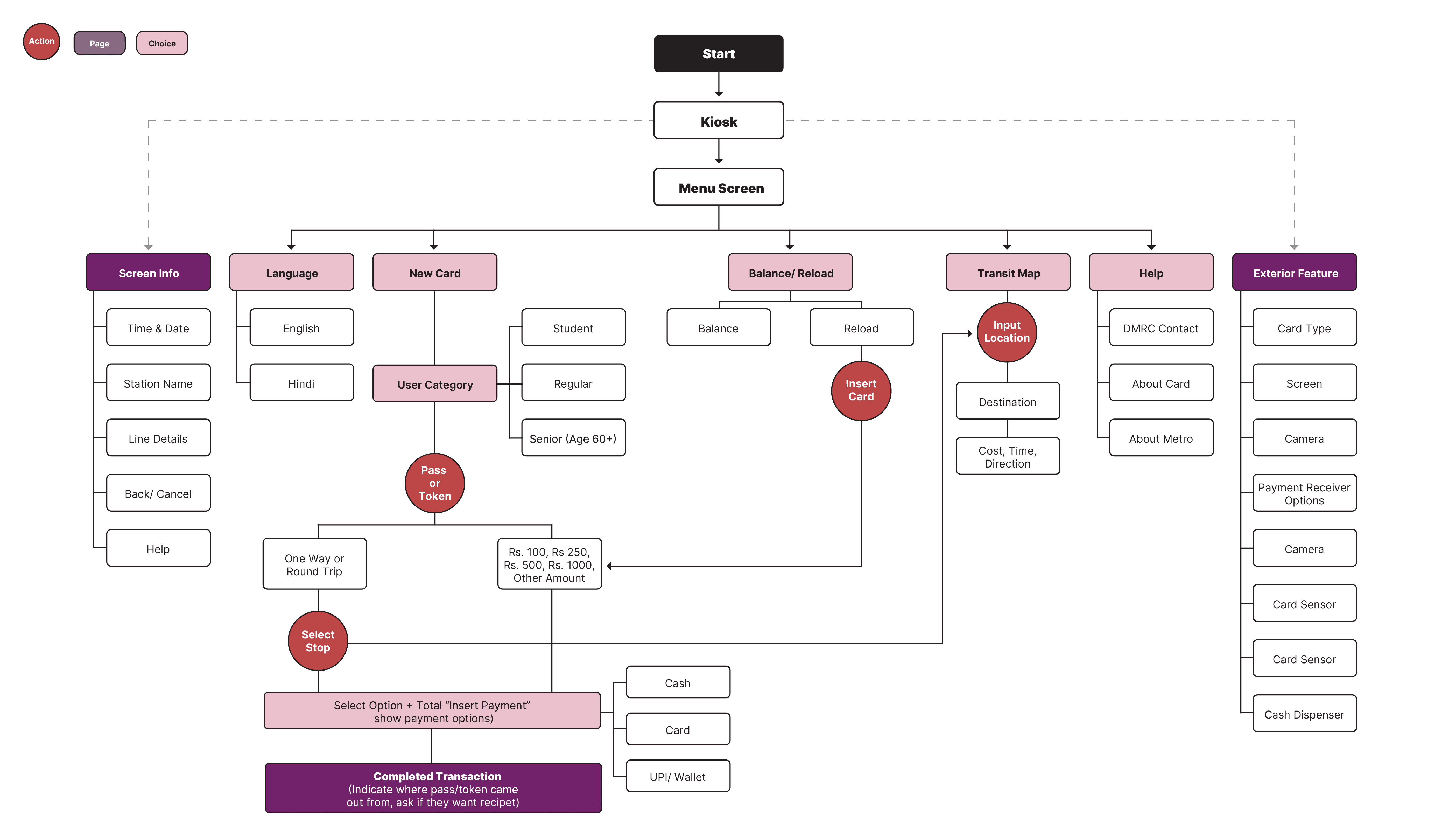
Information Architecture
We compared it to the Delhi Metro framework, and cleaned up the redundancy while rearranging it into a new IA.
Searchability
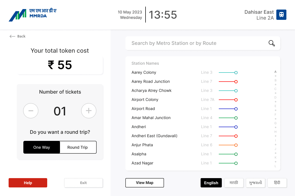
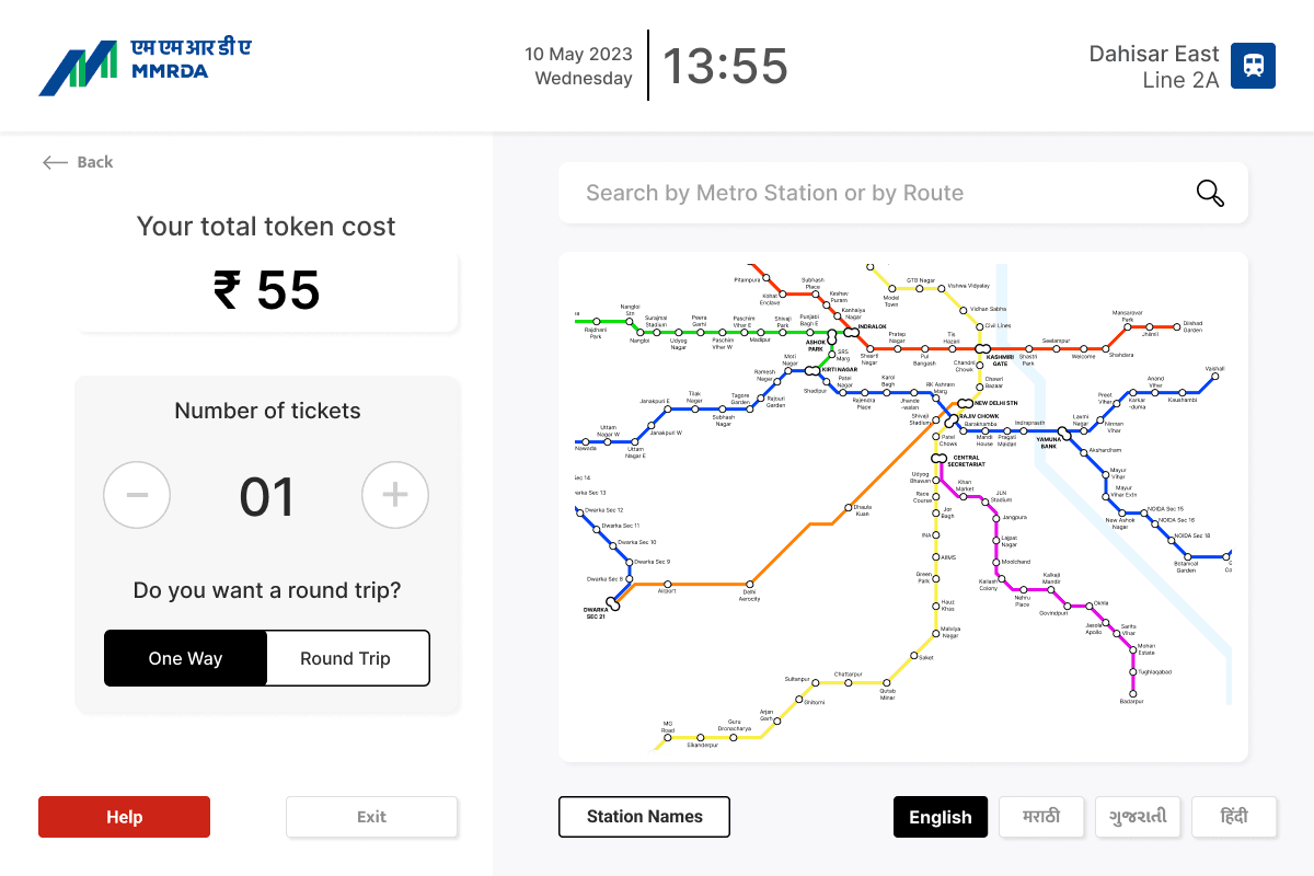
From remote testing, we figured that most of the users wanted to search using station table but as it wasn’t fully prototyped therefore they end up using textual search. Later, after prototyping all three type of search — station table, metro map and textual search, we determined that 50% used station table, 37.5% used map search while only 12.5% used textual search.
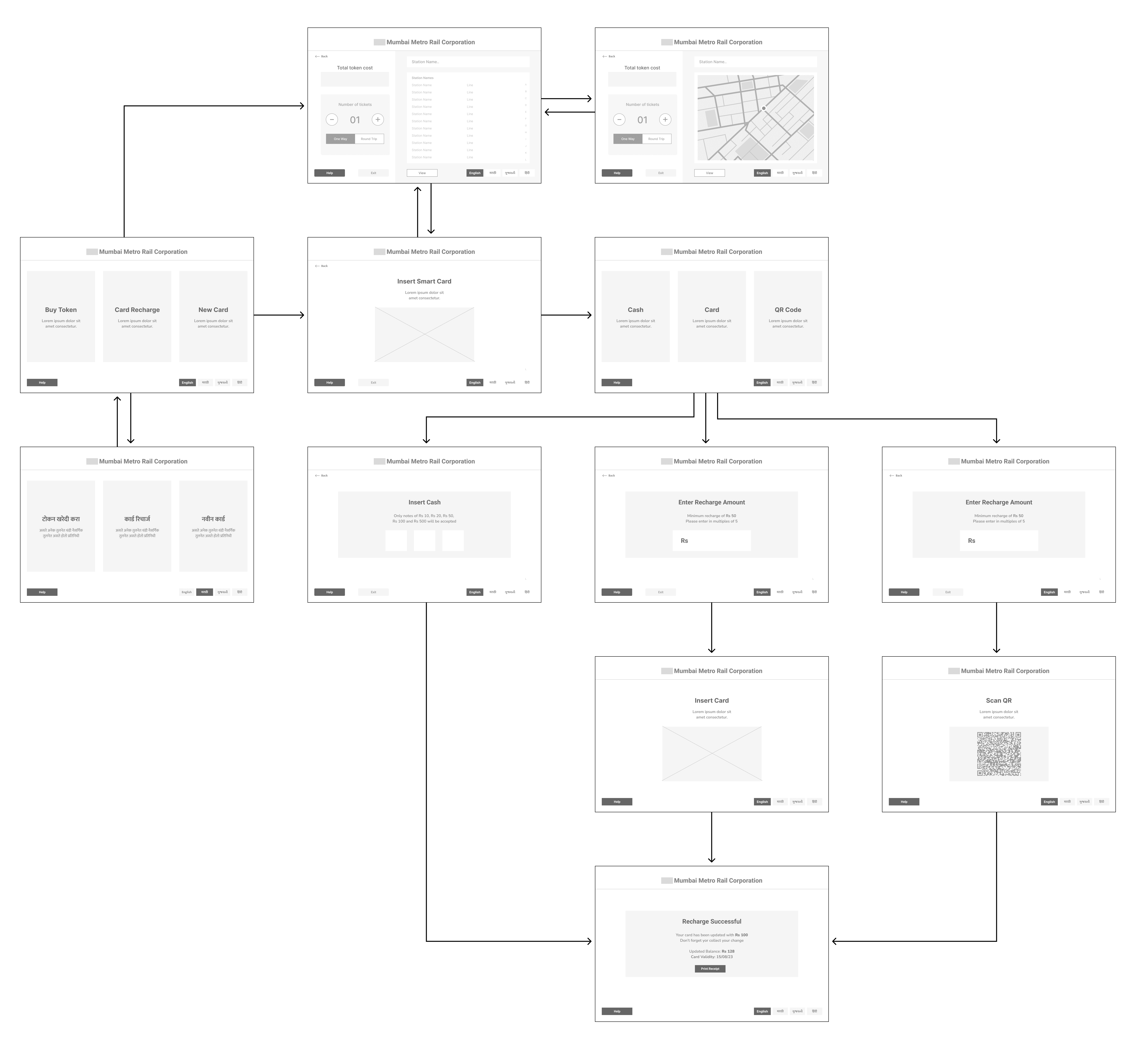
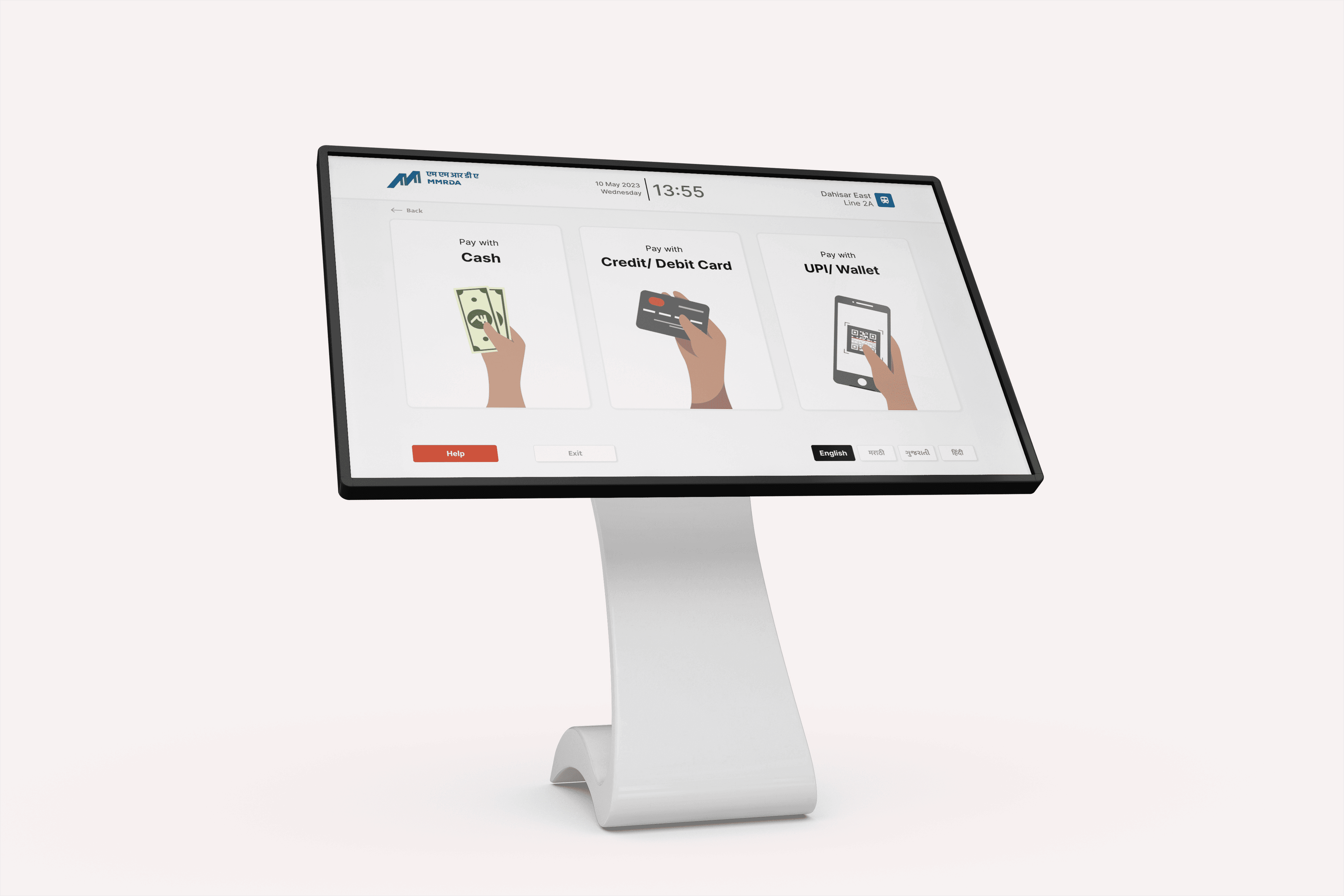
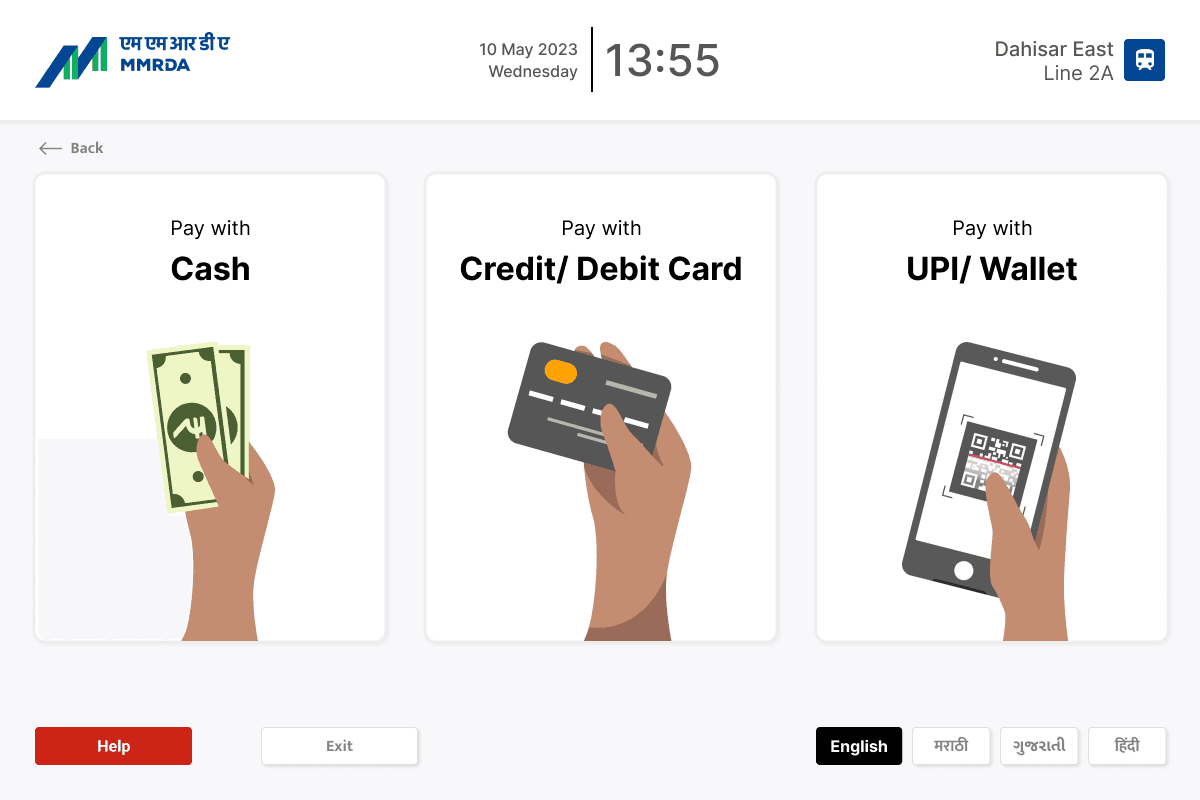
Prototype
Final high-fidelity prototype with the updated new screens and user flow.
Implementation of Results
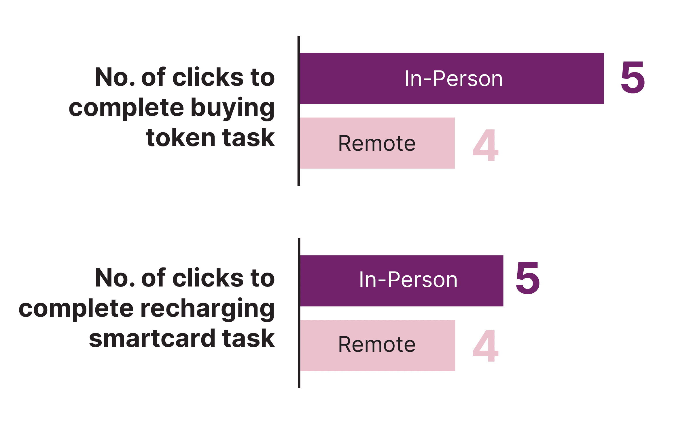
11 out of the 13 users completed both tasks within 30 seconds. And 12 out of 13 were able to complete both the tasks successfully without any outside assistance required.
For Task 1 (i.e. Buying a single journey token), number of clicks to complete the task were 8. And after implementing our finding from remote testing, the number of clicks reduced to 6. Similarly, for task 2, number of clicks reduced from 5 to 4.
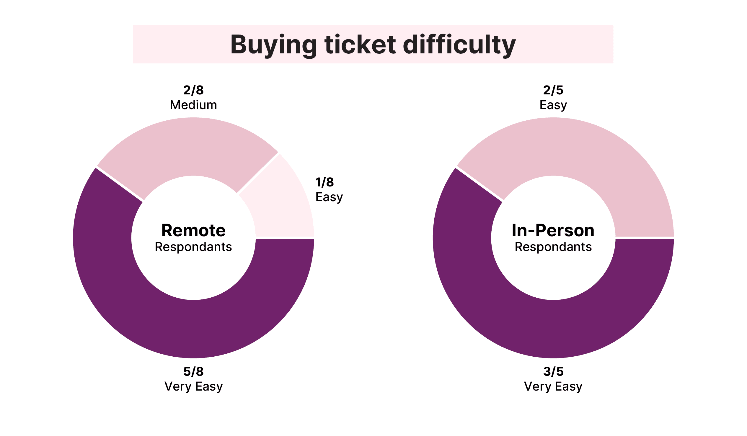
In remote testing, 2 out of 8 users said the task had medium difficulty while after implementing our findings, no user claimed medium difficulty but either easy or very easy. No one said the tasks were difficult or very difficult.
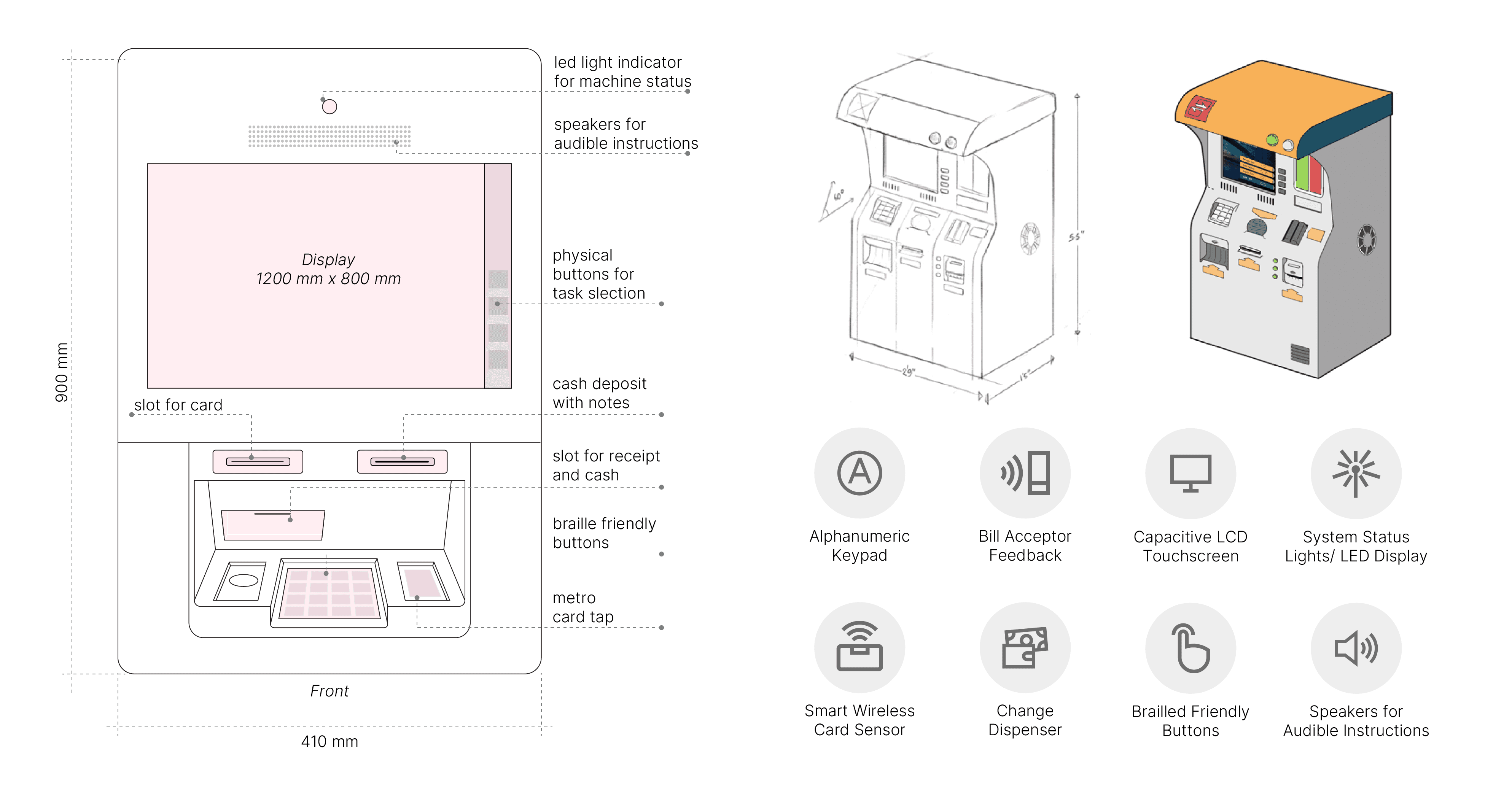
Product Design
Kiosk design and product specifications, keeping in mind user flow and experience as well as affinity mapping. The design aims to be accessible to all users while being simple and easy to install in metro stations.
Anushka Mathur
ZenAir
CityNAV/MMRC
CityNAV/MMRC
A concept air-inflated isolation pods which can be used in any future pandemic situation like the COVID-19 pandemic.
Designing a ticket kiosk with a working User
Interface (UI) for the Mumbai Metro.
Designing a ticket kiosk with a working
User Interface (UI) for the Mumbai Metro.
May 2022
Individual Project
Feb 2022 - March 2022
Group Project
Feb 2022 - March 2022
Group Project
Overview
Background
Background
Sed ut perspiciatis unde omnis iste natus error sit voluptatem. Ut enim ad minima veniam, quis nostrum exercitationem ullam corporis suscipit laboriosam. Neque porro quisquam est, qui dolorem ipsum quia dolor sit amet, consectetur, adipisci velit.
The newly opened Mumbai Metro is a rapid transit (MRT) system serving the city of Mumbai and the wider Mumbai Metropolitan Region in Maharashtra, India. It is designed to reduce traffic congestion in the city and supplement the overcrowded Mumbai Suburban Railway network. The network is made up of 10 colour coded lines that server 100+ stations. Since the transit network is still being developed, people often have to spend upwards of 30 minutes waiting in lines. As a result, before the city expands its metro network, it is essential to enhance its ticketing system and overall user experience. We were tasked with designing a SmartCard kiosk/machine that would be installed at all the stations for issuing new cards, recharging cards, and getting single journey tokens.
The newly opened Mumbai Metro is a rapid transit (MRT) system serving the city of Mumbai and the wider Mumbai Metropolitan Region in Maharashtra, India. It is designed to reduce traffic congestion in the city and supplement the overcrowded Mumbai Suburban Railway network. The network is made up of 10 colour coded lines that server 100+ stations. Since the transit network is still being developed, people often have to spend upwards of 30 minutes waiting in lines. As a result, before the city expands its metro network, it is essential to enhance its ticketing system and overall user experience. We were tasked with designing a SmartCard kiosk/machine that would be installed at all the stations for issuing new cards, recharging cards, and getting single journey tokens.
Anushka Mathur
The Process
Research Plan
User Interviews
At the start of the project, we carried 100 quantitative interviews and 30 in-depth interviews with daily users to find the key problems associated with the Mumbai Metro ticketing system.
Stakeholder Insights
Daily Travellers
Daily travellers face an issue with quick transactions to recharge their smart cards.
Occasional Travellers
Some users tend to not have exact change or cards to make payments and thus take other transports.
Help Facility
Users often encounter a significant inconvenience when seeking assistance from station agents.
Turning Stakeholder Insights into Design Goals
Payment Options
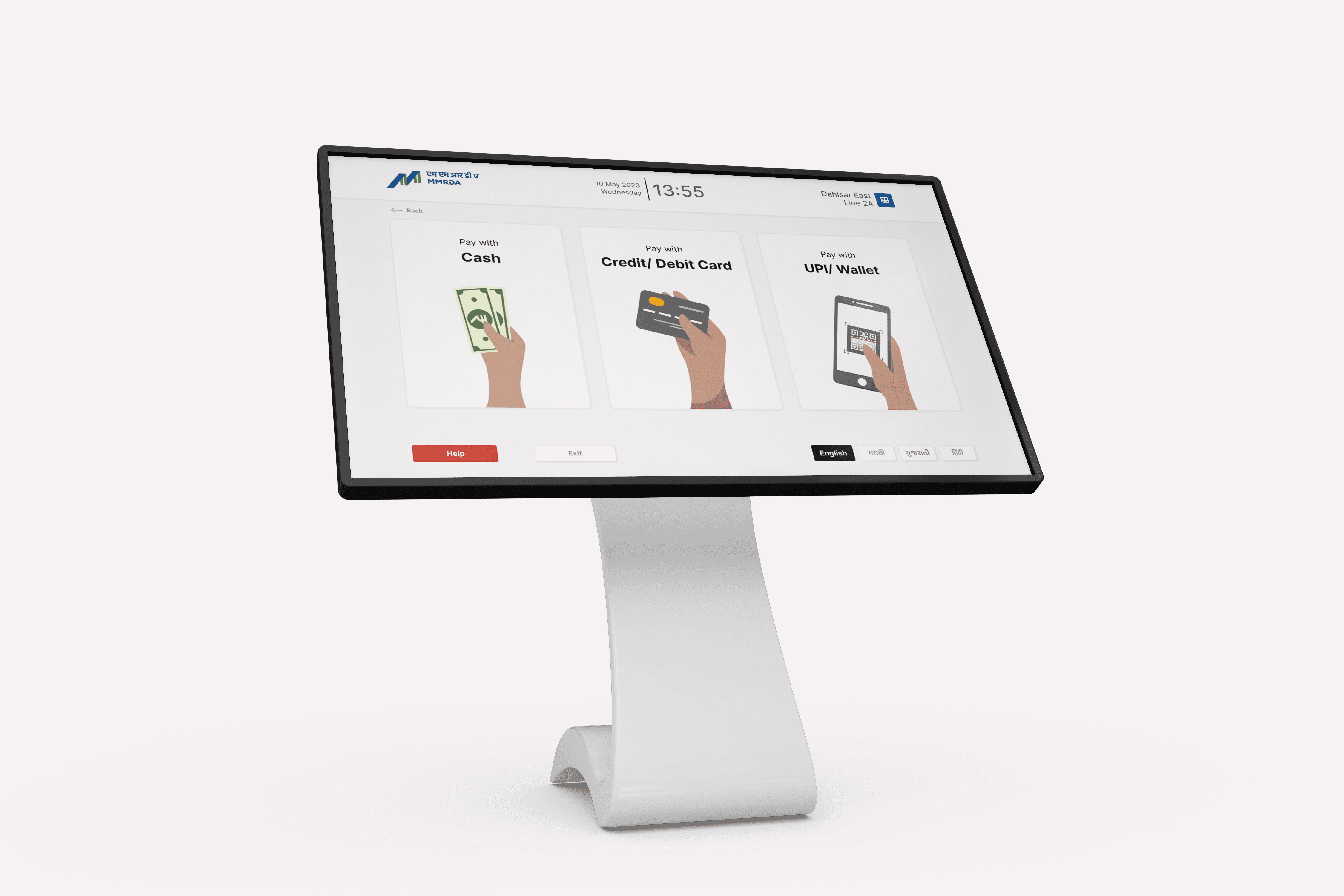
Digital kiosks need to offer multiple payment options as per user needs including wallet and UPI payments.
Help Facility
Providing an on-screen help facility, which informs the station agents for assistance.
Ticket Options
The kiosks should offer single journey tokens as well for not so frequent users.
Stakeholder Mapping
After inverviewing the users, we then created a stakeholder map of all the different users for the metro kiosks
User Personas
Wireframing
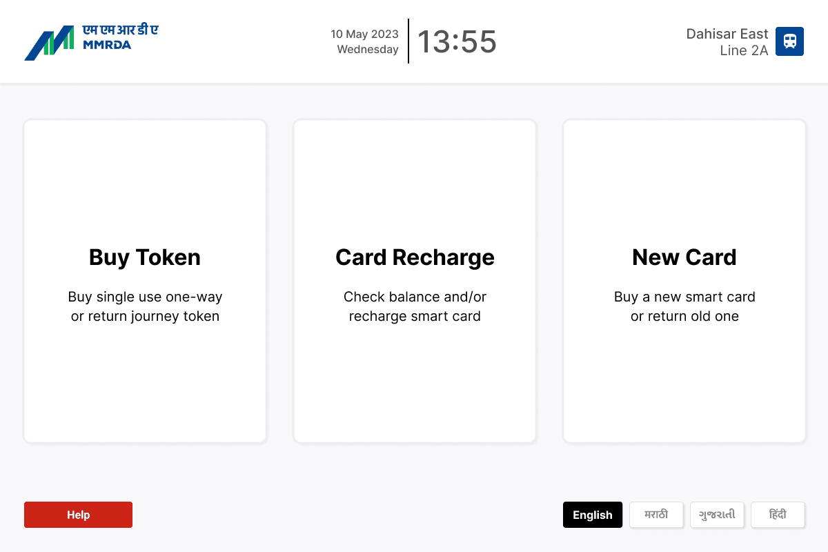
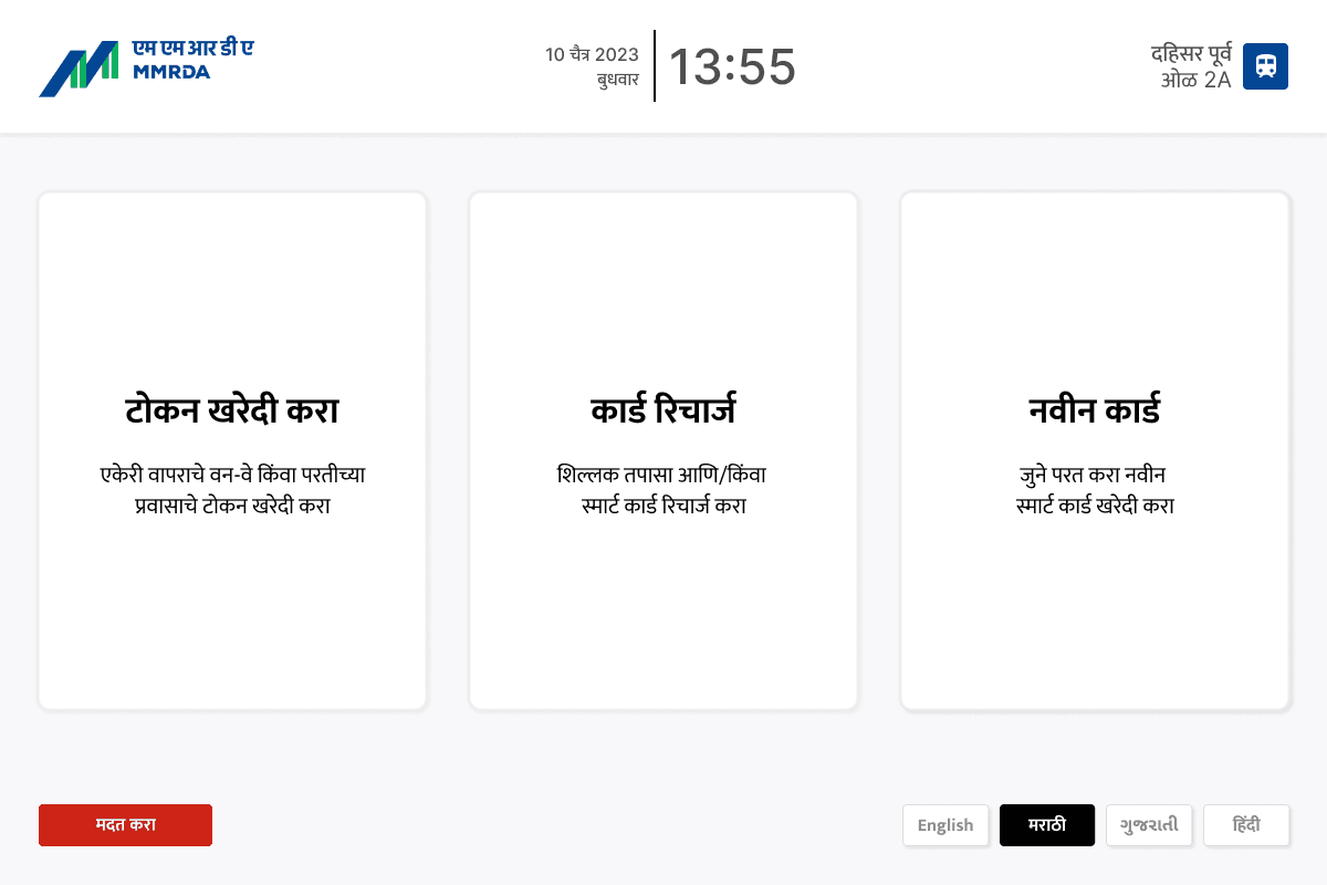
Using the insights from the affinity map, we moved on to create sketch wireframes. We provided multiple language support to address the multilingual population of Mumbai, and recommended a simple UI. We added numerical input on screen as well as provided for physical buttons on the machine. Next, we moved on to refining the sketches in Figma, and deciding on a system and its subsequent patterns.
Choosing Features
The area of context as well as the activities involved were analysed in order to build a user-centric interface. These types of tasks were divided into categories based on patterns and behaviours. We divided them into three key categories - Product, Interface, and Space Design. These categories were then further divided using the MoSCoW Method, which led to the finalisation of the key design solutions which could be integrated into the kiosk designs. These design solutions were selected according to their adaptability into accessible navigation systems and information architecture while staying within the technological restrictions.
User Journey and Flow
Study unveiled how people preferred a straight-forward method in quick tasks and do not entertain distractions. Therefore, we suggested simpler looking interface and lesser screens. We also compared the interface of servial terminals and considered the logic of our displays when considering the journey map.
Information Architecture
We compared it to the Delhi Metro framework, and cleaned up the redundancy while rearranging it into a new IA.
Initial Prototype
Screens
User Testing
We tested our prototype with 8 user remotely (via usertesting.com) and 5 in-person and later incorporated the insights we had gathered to resign the kiosk screens.
In addition to other questions, two major tasks for usertesting included:
Task 1: Buy a single-journey token
Task 2: Refill smartcard
Implementation and Results
11 out of the 13 users completed both tasks within 30 seconds. And 12 out of 13 were able to complete both the tasks successfully without any outside assistance required.
For Task 1 (i.e. Buying a single journey token), number of clicks to complete the task were 8. And after implementing our finding from remote testing, the number of clicks reduced to 6. Similarly, for task 2, number of clicks reduced from 5 to 4.
In remote testing, 2 out of 8 users said the task had medium difficulty while after implementing our findings, no user claimed medium difficulty but either easy or very easy. No one said the tasks were difficult or very difficult.
Searchability
From remote testing, we figured that most of the users wanted to search using station table but as it wasn’t fully prototyped therefore they end up using textual search. Later, after prototyping all three type of search — station table, metro map and textual search, we determined that 50% used station table, 37.5% used map search while only 12.5% used textual search.
Prototype
Final high-fidelity prototype with the updated new screens and user flow.
Product Design
Kiosk design and product specifications, keeping in mind user flow and experience as well as affinity mapping. The design aims to be accessible to all users while being simple and easy to install in metro stations.
The Situation
The Mumbai Metro, developed as a solution to ease the strain on the Suburban Railway network, faces critical challenges in its operational phase. At present, only 3 lines are operational serving a total of 43 stations. Overcrowding plagues operator-manned kiosks, creating long queues and delays for commuters due to the limited number of operational lines and stations. Additionally, the existing digital kiosks offer limited payment options - only cash or card, contributing to increased congestion and frustration among users, as it excludes certain payment methods and prolongs transaction times.
The overall ticketing infrastructure struggles to cope with the burgeoning commuter traffic, resulting in bottlenecks and an unsatisfactory user experience for passengers relying on this essential mode of transportation.
The Process
Research Plan
User Interviews
At the start of the project, we carried 100 quantitative interviews and 30 in-depth interviews with daily users to find the key problems associated with the Mumbai Metro ticketing system.
User Interviews
At the start of the project, we carried 100 quantitative interviews and 30 in-depth interviews with daily users to find the key problems associated with the Mumbai Metro ticketing system.
Stakeholder Mapping
After inverviewing the users, we then created a stakeholder map of all the different users for the metro kiosks
Stakeholder Mapping
After inverviewing the users, we then created a stakeholder map of all the different users for the metro kiosks
Stakeholder Insights
Daily Travellers
Daily travellers face an issue with quick transactions to recharge their smart cards.
Occasional Travellers
Some users tend to not have exact change or cards to make payments and thus take other transports.
Help Facility
Users often encounter a significant inconvenience when seeking assistance from station agents.
Turning Stakeholder Insights into Design Goals
Payment Options
Digital kiosks need to offer multiple payment options as per user needs including wallet and UPI payments.
Help Facility
Providing an on-screen help facility, which informs the station agents for assistance.
Ticket Options
The kiosks should offer single journey tokens as well for not so frequent users.
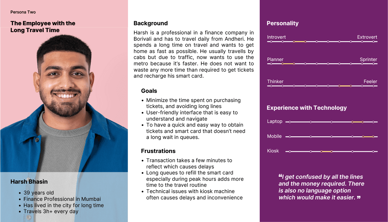
User Personas
User Personas
Choosing Features
The area of context as well as the activities involved were analysed in order to build a user-centric interface. These types of tasks were divided into categories based on patterns and behaviours. We divided them into three key categories - Product, Interface, and Space Design. These categories were then further divided using the MoSCoW Method, which led to the finalisation of the key design solutions which could be integrated into the kiosk designs. These design solutions were selected according to their adaptability into accessible navigation systems and information architecture while staying within the technological restrictions.
User Journey and Flow
Study unveiled how people preferred a straight-forward method in quick tasks and do not entertain distractions. Therefore, we suggested simpler looking interface and lesser screens. We also compared the interface of servial terminals and considered the logic of our displays when considering the journey map.
Information Architecture
We compared it to the Delhi Metro framework, and cleaned up the redundancy while rearranging it into a new IA.
Information Architecture
We compared it to the Delhi Metro framework, and cleaned up the redundancy while rearranging it into a new IA.
Wireframing
Using the insights from the affinity map, we moved on to create sketch wireframes. We provided multiple language support to address the multilingual population of Mumbai, and recommended a simple UI. We added numerical input on screen as well as provided for physical buttons on the machine. Next, we moved on to refining the sketches in Figma, and deciding on a system and its subsequent patterns.
Initial Prototype
Screens
Initial Prototype
Screens
User Testing
We tested our prototype with 8 user remotely (via usertesting.com) and 5 in-person and later incorporated the insights we had gathered to resign the kiosk screens.
In addition to other questions, two major tasks for usertesting included:
Task 1: Buy a single-journey token
Task 2: Refill smartcard
Implementation and Results
11 out of the 13 users completed both tasks within 30 seconds. And 12 out of 13 were able to complete both the tasks successfully without any outside assistance required.
For Task 1 (i.e. Buying a single journey token), number of clicks to complete the task were 8. And after implementing our finding from remote testing, the number of clicks reduced to 6. Similarly, for task 2, number of clicks reduced from 5 to 4.
In remote testing, 2 out of 8 users said the task had medium difficulty while after implementing our findings, no user claimed medium difficulty but either easy or very easy. No one said the tasks were difficult or very difficult.
Searchability
From remote testing, we figured that most of the users wanted to search using station table but as it wasn’t fully prototyped therefore they end up using textual search. Later, after prototyping all three type of search — station table, metro map and textual search, we determined that 50% used station table, 37.5% used map search while only 12.5% used textual search.
Prototype
Final high-fidelity prototype with the updated new screens and user flow.
Product Design
Kiosk design and product specifications, keeping in mind user flow and experience as well as affinity mapping. The design aims to be accessible to all users while being simple and easy to install in metro stations.
Product Design
Kiosk design and product specifications, keeping in mind user flow and experience as well as affinity mapping. The design aims to be accessible to all users while being simple and easy to install in metro stations.
Role
Research: Survey, Participant outreach, Semi-structured interviews, user persona, user journey, site analysis, literature review
Design: Wire framing, high-fidelity prototyping, usability testing
Tools
Figma
Google Docs
Miro
The Situation
The Mumbai Metro, developed as a solution to ease the strain on the Suburban Railway network, faces critical challenges in its operational phase. At present, only 3 lines are operational serving a total of 43 stations. Overcrowding plagues operator-manned kiosks, creating long queues and delays for commuters due to the limited number of operational lines and stations. Additionally, the existing digital kiosks offer limited payment options - only cash or card, contributing to increased congestion and frustration among users, as it excludes certain payment methods and prolongs transaction times.
The overall ticketing infrastructure struggles to cope with the burgeoning commuter traffic, resulting in bottlenecks and an unsatisfactory user experience for passengers relying on this essential mode of transportation.
The Process
Research Plan
User Interviews
At the start of the project, we carried 100 quantitative interviews and 30 in-depth interviews with daily users to find the key problems associated with the Mumbai Metro ticketing system.
Stakeholder Mapping
After inverviewing the users, we then created a stakeholder map of all the different users for the metro kiosks
Stakeholder Insights
Daily Travellers
Daily travellers face an issue with quick transactions to recharge their smart cards.
Occasional Travellers
Some users tend to not have exact change or cards to make payments and thus take other transports.
Help Facility
Users often encounter a significant inconvenience when seeking assistance from station agents.
Turning Stakeholder Insights into Design Goals
Payment Options
Digital kiosks need to offer multiple payment options as per user needs including wallet and UPI payments.
Help Facility
Providing an on-screen help facility, which informs the station agents for assistance.
Ticket Options
The kiosks should offer single journey tokens as well for not so frequent users.
User Personas
Choosing Features
The area of context as well as the activities involved were analysed in order to build a user-centric interface. These types of tasks were divided into categories based on patterns and behaviours. We divided them into three key categories - Product, Interface, and Space Design. These categories were then further divided using the MoSCoW Method, which led to the finalisation of the key design solutions which could be integrated into the kiosk designs. These design solutions were selected according to their adaptability into accessible navigation systems and information architecture while staying within the technological restrictions.
User Journey and Flow
Study unveiled how people preferred a straight-forward method in quick tasks and do not entertain distractions. Therefore, we suggested simpler looking interface and lesser screens. We also compared the interface of servial terminals and considered the logic of our displays when considering the journey map.
Information Architecture
We compared it to the Delhi Metro framework, and cleaned up the redundancy while rearranging it into a new IA.
Wireframing
Using the insights from the affinity map, we moved on to create sketch wireframes. We provided multiple language support to address the multilingual population of Mumbai, and recommended a simple UI. We added numerical input on screen as well as provided for physical buttons on the machine. Next, we moved on to refining the sketches in Figma, and deciding on a system and its subsequent patterns.
Initial Prototype
Screens
User Testing
We tested our prototype with 8 user remotely (via usertesting.com) and 5 in-person and later incorporated the insights we had gathered to resign the kiosk screens.
In addition to other questions, two major tasks for usertesting included:
Task 1: Buy a single-journey token
Task 2: Refill smartcard
Implementation and Results
11 out of the 13 users completed both tasks within 30 seconds. And 12 out of 13 were able to complete both the tasks successfully without any outside assistance required.
For Task 1 (i.e. Buying a single journey token), number of clicks to complete the task were 8. And after implementing our finding from remote testing, the number of clicks reduced to 6. Similarly, for task 2, number of clicks reduced from 5 to 4.
In remote testing, 2 out of 8 users said the task had medium difficulty while after implementing our findings, no user claimed medium difficulty but either easy or very easy. No one said the tasks were difficult or very difficult.
Searchability
From remote testing, we figured that most of the users wanted to search using station table but as it wasn’t fully prototyped therefore they end up using textual search. Later, after prototyping all three type of search — station table, metro map and textual search, we determined that 50% used station table, 37.5% used map search while only 12.5% used textual search.
Prototype
Final high-fidelity prototype with the updated new screens and user flow.
Product Design
Kiosk design and product specifications, keeping in mind user flow and experience as well as affinity mapping. The design aims to be accessible to all users while being simple and easy to install in metro stations.